
 Dedicated Team / White Label - Offshore Developers, Maintenance & Agency Support
WordPress & WooCommerce - Custom Themes, Plugins & Store Development
Web Development - HubSpot CMS, PHP, Laravel, CodeIgniter, CakePHP, MERN, MEAN
Shopify & eCommerce - Shopify, PrestaShop, Magento, BigCommerce
UI/UX & Frontend - Figma, XD, HTML & Responsive Design
Mobile App Development - iOS, Android, Flutter, React Native
Dedicated Team / White Label - Offshore Developers, Maintenance & Agency Support
WordPress & WooCommerce - Custom Themes, Plugins & Store Development
Web Development - HubSpot CMS, PHP, Laravel, CodeIgniter, CakePHP, MERN, MEAN
Shopify & eCommerce - Shopify, PrestaShop, Magento, BigCommerce
UI/UX & Frontend - Figma, XD, HTML & Responsive Design
Mobile App Development - iOS, Android, Flutter, React Native
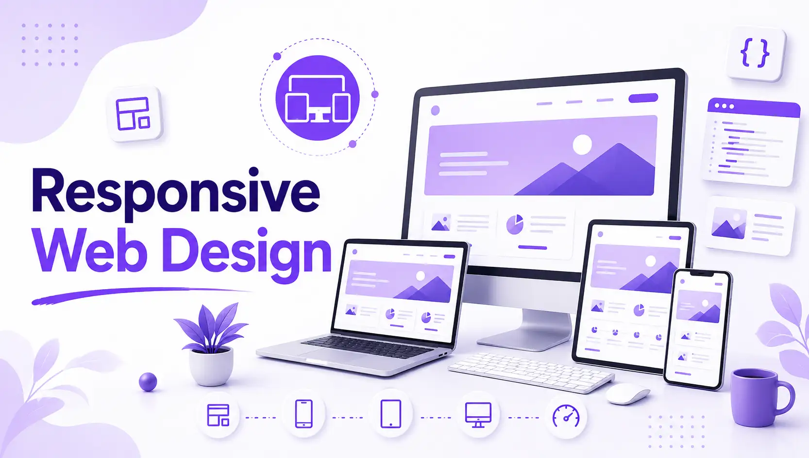
Responsive web design ensures your website adapts seamlessly to any screen size or device, providing a consistent and user-friendly experience across desktops, tablets, and smartphones.
At Neo Coderz, we create responsive web designs that provide a smooth user experience on all devices. By using modern technologies like HTML5, CSS3, and JavaScript, we ensure your website looks great and functions perfectly on smartphones, tablets, and desktops.
We focus on optimizing your website's layout and performance to enhance user engagement and conversions. Our responsive designs adapt automatically to screen sizes, reducing the need for multiple versions of your site.
Our designs prioritize easy navigation and fast loading speeds, improving user satisfaction and retention. We ensure that your website is accessible and user-friendly across various platforms.
With our responsive web design services, your site will be optimized for mobile and desktop users, providing better search engine rankings and helping you stay competitive in today’s digital landscape.

According to a report a large parcentage of traffice come from mobile. Therefore, it’s increasingly important for companies to have websites that render properly on smaller screens so that users don’t encounter distorted images or experience a sub-optimal site layout.

Making one responsive website takes considerably less time than making a stand-alone mobile application in addition to a standard desktop website. Since time is money, responsive design naturally costs less than the alternative.

Maintaining a separate mobile site requires additional testing and support. In contrast, the process of responsive design uses standardized testing methodologies to ensure optimal layout on every screen.

A responsive and optimized mobile site provides a much better user experience for the visitor. Therefore, it is much more likely that they’ll stick around for a longer period of time.

Lowering your bounce rate is only half of the battle. Creating a consistent user experience across all devices is key to converting new customers.

Responsive web design is becoming as important to search engine optimization as quality content. Stronger backlinks and better bounce rates translate into higher search rankings, but there’s an extra SEO benefit for mobile optimized sites.
Our PrestaShop development services include custom themes, module integration, and seamless migrations, ensuring a scalable and high-performance online store.
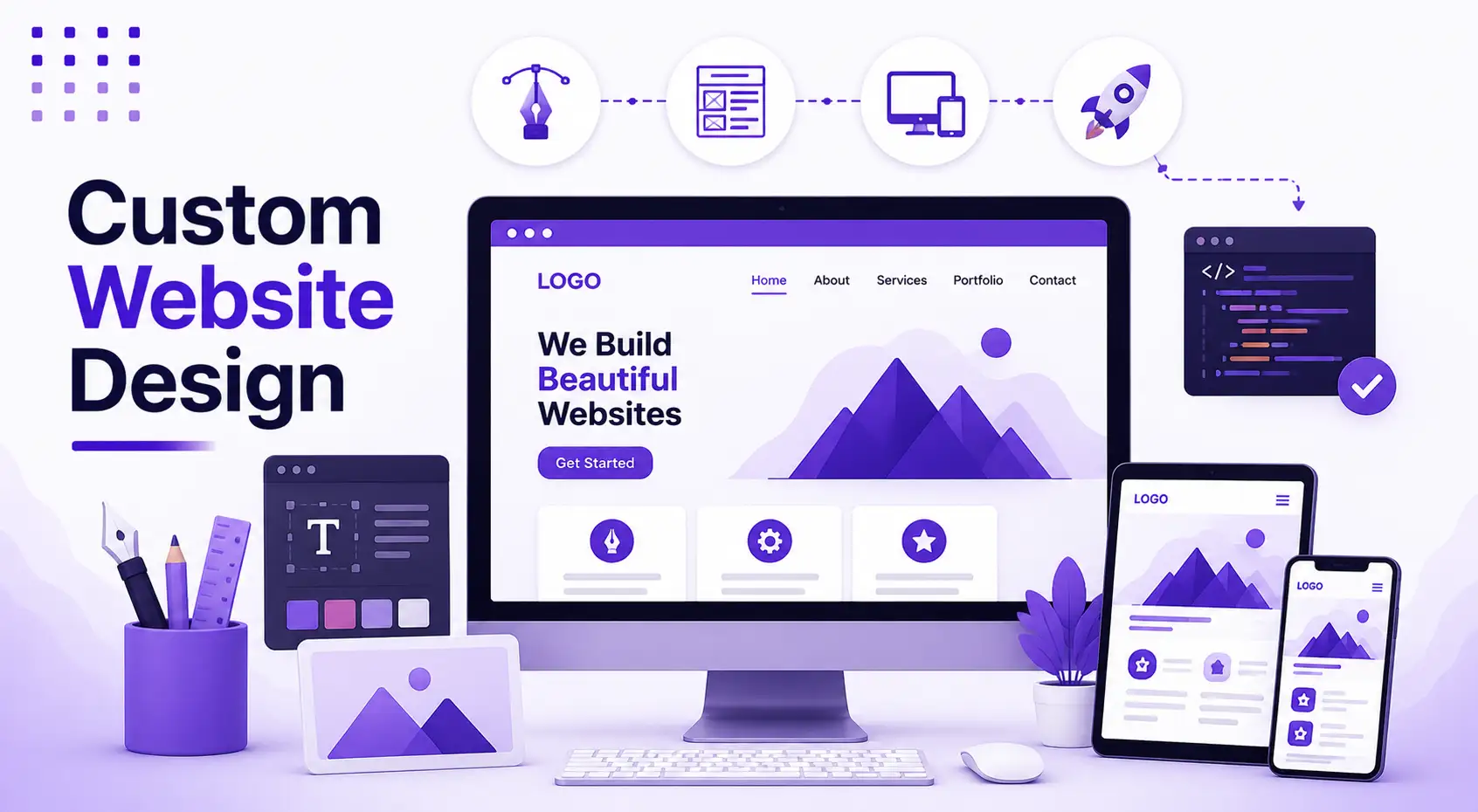
Our responsive web design services deliver visually appealing, fast-loading, and user-friendly websites that adapt seamlessly to all screen sizes. We prioritize mobile-first design, intuitive navigation, and optimized performance to enhance user engagement and improve conversions. By integrating the latest web technologies, we ensure accessibility, cross-browser compatibility, and a consistent brand experience. Whether for a new website or redesign, our solutions help businesses create a strong digital presence.
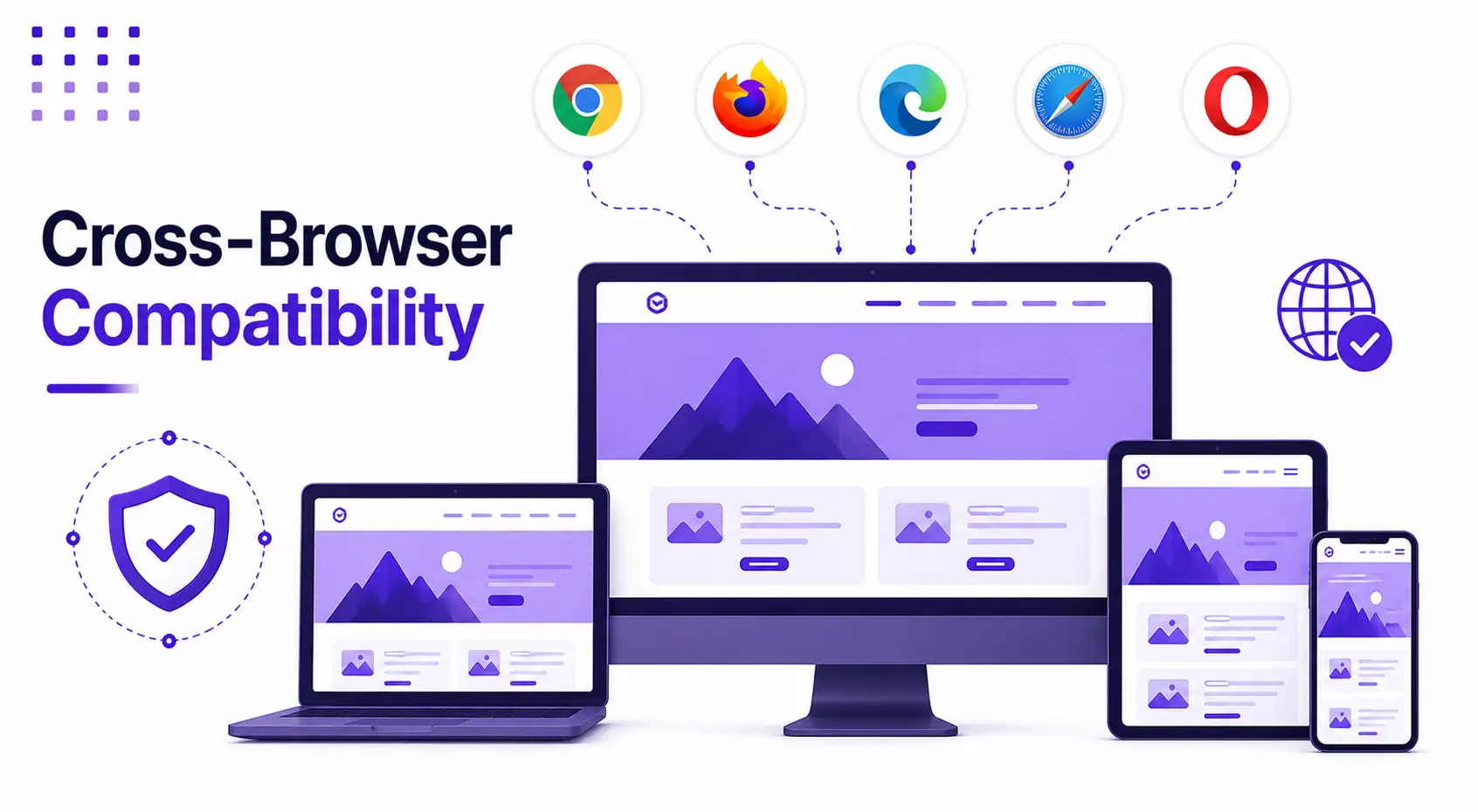
Ensure a flawless browsing experience across all platforms with our Cross-Browser Compatibility services. Our experts optimize your website to perform seamlessly on major browsers like Chrome, Firefox, Safari, and Edge. In addition to technical compatibility, we offer tailored small business web design services and expert website design consultation. This ensures that your website reaches a broader audience while maintaining a consistent and engaging user experience across all devices.
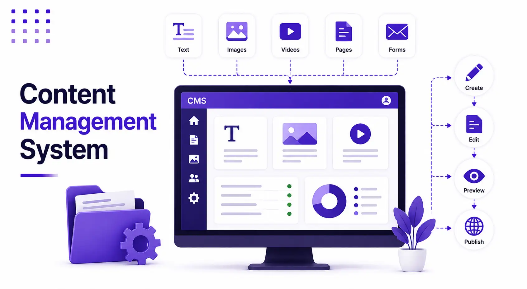
We specialize in integrating intuitive Content Management Systems (CMS) like WordPress, ensuring seamless website administration. Our responsive design and web service integration allow you to manage content, updates, and customization effortlessly. With a user-friendly interface and scalable solutions, we empower you to maintain and enhance your website without technical complexities.
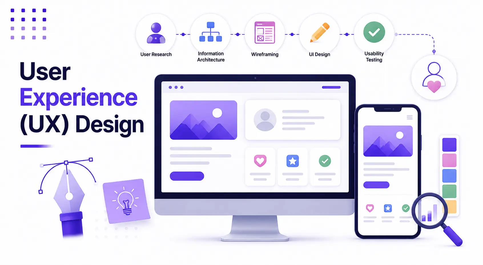
Our responsive web design services focus on intuitive navigation, accessibility, and usability to maximize user satisfaction. By implementing user-centric design principles, we create seamless experiences that allow visitors to navigate effortlessly, find information quickly, and engage across all devices. Enhance user experience and boost engagement with our expertly crafted UX design solutions.
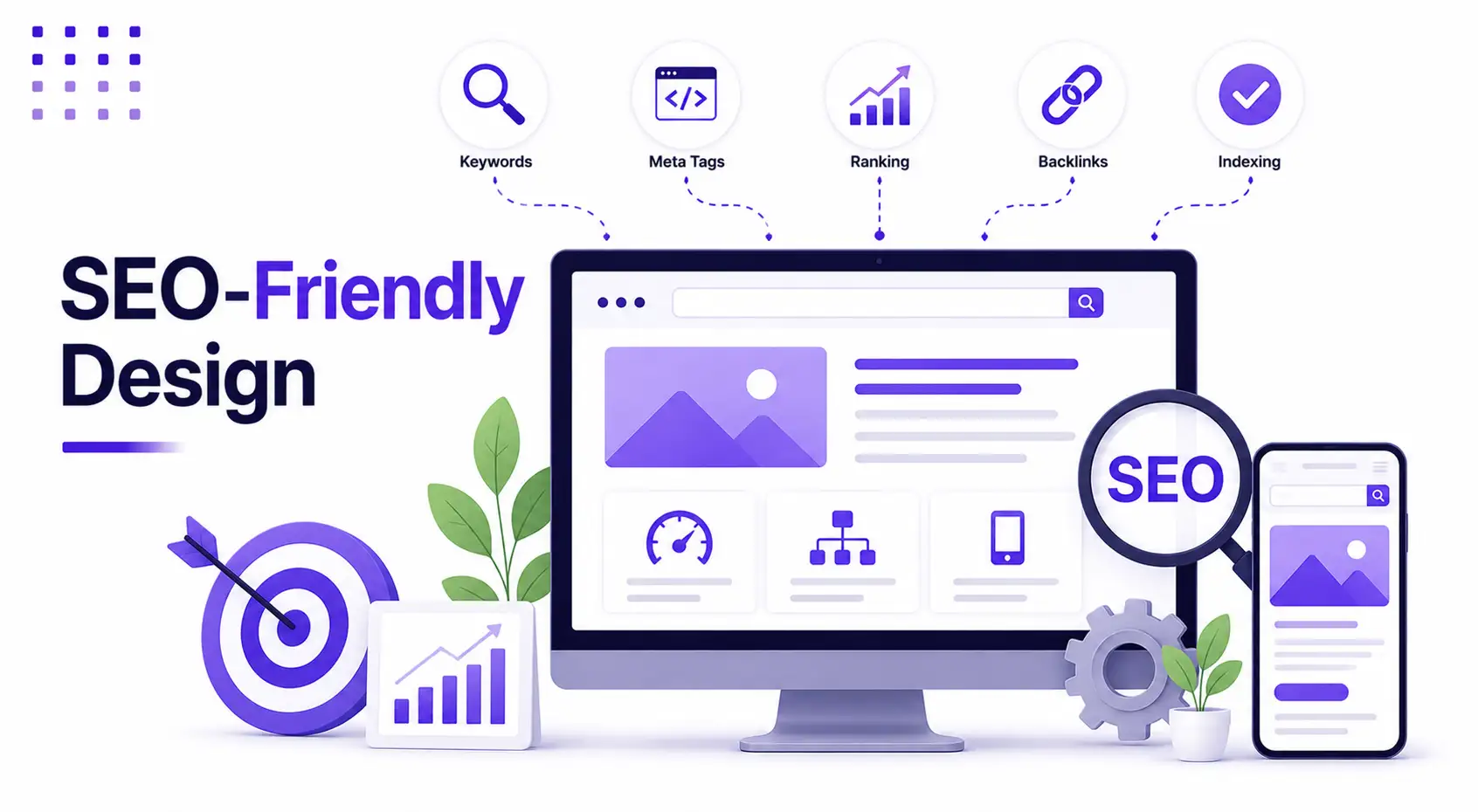
Boost your online presence with our SEO-Friendly Design services. We integrate the best optimization practices, responsive design, and seamless web service integration to ensure your website ranks higher on search engines. Our designs are visually appealing and performance-driven, helping you attract more traffic and grow your digital footprint effectively.
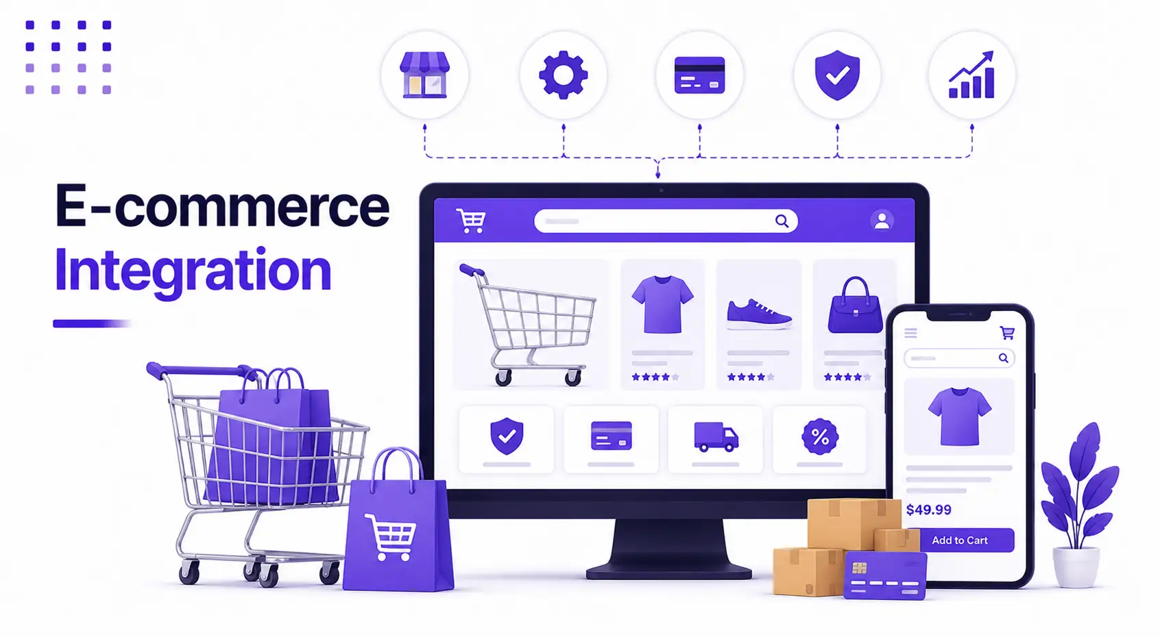
We create responsive e-commerce websites that provide a seamless shopping experience across all devices. Our designs ensure smooth navigation, effortless product browsing, and an optimized checkout process to boost user engagement and conversions. Enhance your online store with a mobile-friendly, user-centric interface tailored for success.
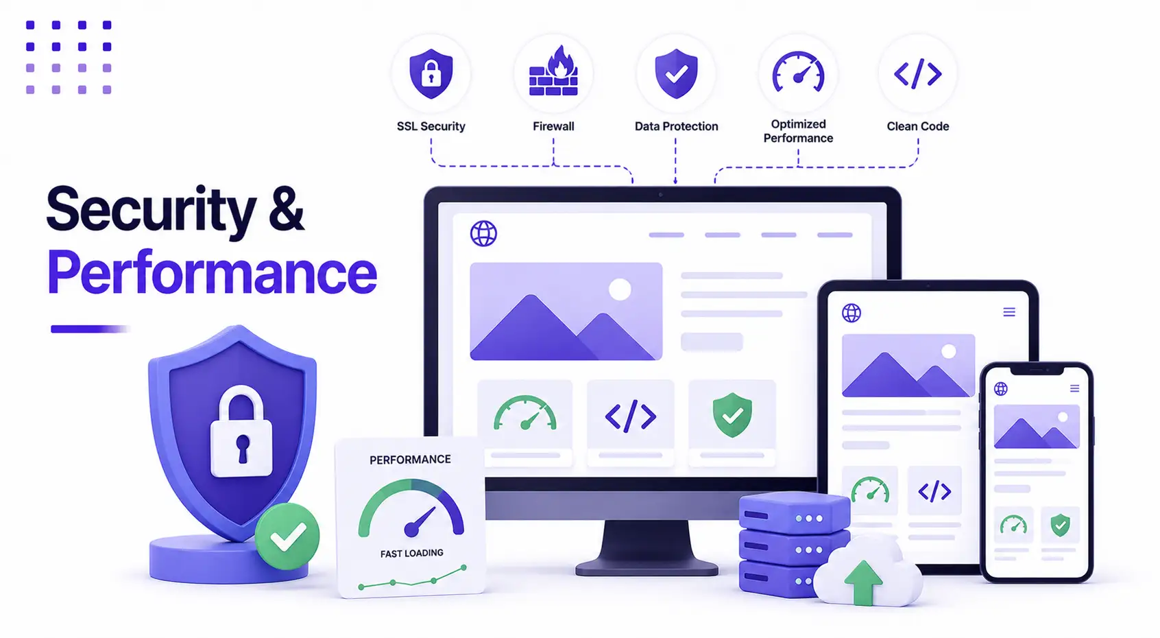
Security and performance are our top priorities. We implement strong security measures to protect your website from potential threats while optimizing performance for fast loading times and a smooth browsing experience. Our responsive web design services also cater to small businesses, offering expert website design consultation to enhance your online presence.
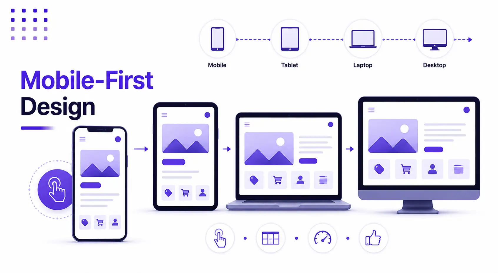
Efficient mobile design is a key priority in our responsive web design services. We ensure that your website delivers a seamless experience across all mobile devices, adapting flawlessly to various screen sizes and resolutions. Our mobile-first approach enhances usability, improves loading speed, and ensures intuitive navigation. Whether on smartphones or tablets, we create optimized, high-performance websites that drive user engagement and conversions.
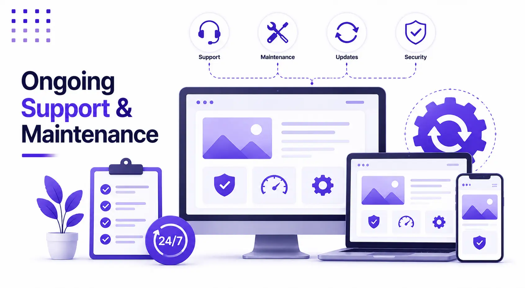
We ensure your website stays optimized and fully functional across all devices with our responsive web design services. Our team provides ongoing support, regular updates, and essential maintenance, including bug fixes, content revisions, and performance enhancements. By continuously monitoring and improving your website, we help maintain a seamless user experience, strong security, and top-notch performance, keeping your audience engaged and your business ahead of the competition.
We choose the right technology based on your website, eCommerce, or app development goals, budget, scalability needs, and long-term maintenance requirements.

Our structured, step-by-step approach ensures a seamless and efficient project execution, starting with a deep understanding of your requirements and culminating in the delivery of high-quality, customized IT solutions designed to drive your business forward.
We start by understanding your project goals, target users, required features, design expectations, timeline, and technical needs.

We define the project scope, sitemap, user flow, page structure, milestones, and development approach before starting the build.

We create clean, user-friendly, and mobile-first designs focused on better navigation, clear content flow, and smooth user experience.

Our team develops websites, ecommerce stores, custom platforms, and software solutions using clean code, practical technology, and scalable structure.

OWe test functionality, responsiveness, browser compatibility, forms, speed, and user flow to make sure everything works properly before launch.

After final approval, we move the project live carefully, check all key pages and features, and make sure the launch is smooth.

We work with your preferred project management tools to keep tasks, timelines, updates, approvals, and delivery progress clearly organized.


We communicate through the tools your team already uses, making collaboration simple across different time zones.


As a web development company, Neo Coderz Technologies helps agencies, startups, ecommerce brands, and growing businesses build practical web solutions that improve user experience, support lead generation, and make long-term website management easier.
In today's competitive digital landscape, every business needs a reliable, scalable, and high-performing website that supports its goals. At Neo Coderz Technologies, we focus on building reliable, scalable, and business-focused digital solutions for agencies, startups, ecommerce brands, and growing companies. Our team combines technical experience, clear communication, structured delivery, and long-term support to help clients complete projects with confidence.

Our team brings practical experience across websites, ecommerce, custom applications, and integrations. We also support ongoing maintenance, QA, and long-term technical needs.

We follow structured development practices to build solutions that are easy to manage, update, improve, and scale as your business grows.

We keep every project transparent with regular updates, quick responses, milestone tracking, and clear discussion on requirements, progress, and approvals.

Whether you need project-based development, monthly support, dedicated developers, or white-label agency support, we provide flexible options based on your requirement.

Before delivery, we check functionality, responsiveness, browser compatibility, user flow, forms, performance, and overall quality to make sure the final output is ready for review.

Our support continues after launch with bug fixing, updates, maintenance, improvements, security checks, and future enhancements whenever required.
Choose who you'd like to talk to
 WordPress
 WooCommerce
 Shopify
 HubSpot
 Magento
 BigCommerce
 PrestaShop
 Laravel
 CodeIgniter
 CakePHP
 PHP
PHP Node.js
 JavaScript
 jQuery
 Angular
 Vue.js
 React
React Bootstrap
 Material UI
 GSAP
GSAP Figma
Figma Adobe XD
 Sketch
 Android
 iOS
iOS Flutter
 Ionic
Ionic Kotlin
 Swift
Swift MySQL
MySQL MongoDB
 OpenAI
 ChatGPT
 Gemini
 Claude
 Perplexity
 Mistral AI
 Hugging Face
 Copilot
 LangChain
 Zapier
 Canva
Canva